Subtle Change on iPod nano Pages
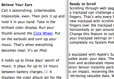
Apple made a subtle adjustment to its product page typography for the iPod nano, which makes the text easier to read. There's a slightly higher line-height value, giving each line a bit more room to breathe.The screenshot below shows the iPod nano page on the left and the PowerBook page on the right.

And no, I don't run diffs on every single page. This one jumped right out at me.

Subtle Change on iPod nano Pages
Posted Sep 7, 2005 — 7 comments below
Posted Sep 7, 2005 — 7 comments below


Ben — Sep 07, 05 375
Ben — Sep 07, 05 376
Brian Andersen — Sep 08, 05 379
Also, just ordered a black 4gb model, fuck they look cool :D
justforyou — Sep 08, 05 380
Scott Stevenson — Sep 08, 05 383
Abhi Beckert — Sep 08, 05 384
Tim Germer — Sep 09, 05 387