


Cocoa Dev Central Redesign
There's a new Cocoa Dev Central design up. Here's a quick rundown of what the design goals were, how the content is different. First, a screenshot: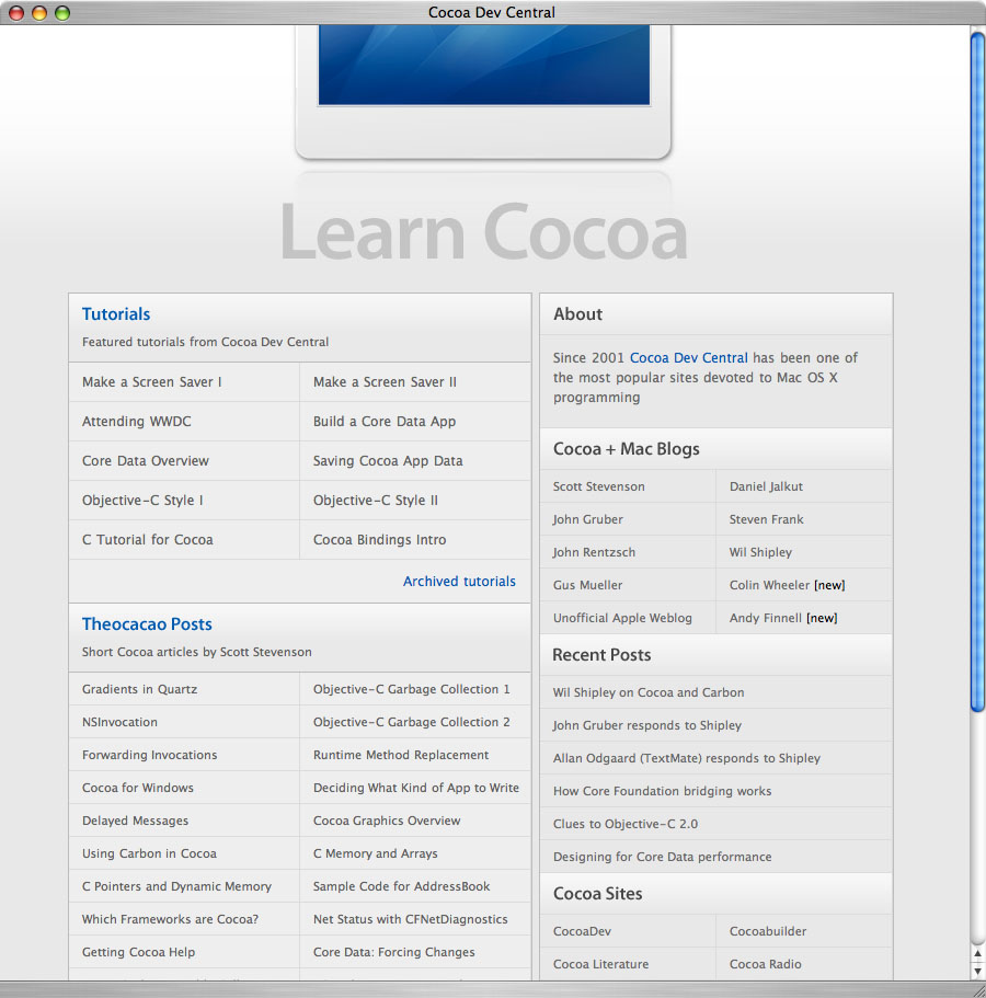
The goal was for the design to have high production values, yet be simple and clear. I didn't set out to do white metal, but I guess that's what we have. This also forced me to go back and find all of the Cocoa content on Theocacao. Turns out there's quite a lot.
Everything validates and markup is very clean (151 lines), which is interesting if you're into that sort of thing. As usual, I designed in Safari and tested in Camino, which uses the Firefox's Gecko engine. No changes were necessary for Gecko. If you're using WinIE to view the site, I wish you the best of luck.
There are some new additions to the Cocoa blogs section. Colin Wheeler has a blog he calls Cocoa Samurai, and already has a bunch of tutorials. Andy Finnel used to work for Macromedia and has been doing a lot of writing, often on Core Data. The Recent Posts section lists a cross-section of relevant Cocoa posts from different places.
One design decision that might seem a bit odd is that the words "Learn Cocoa" are plastered in large block letters across the top instead of the site name. I think if somebody ends up at the site they already know what it's called, and it's just simpler to say what you're doing here. If you think this is crazy talk, check out Apple's site. Interesting, no?

Cocoa Dev Central Redesign
Posted Oct 10, 2006 — 23 comments below
Posted Oct 10, 2006 — 23 comments below


duzbin — Oct 10, 06 2004
The gradient across the page is all squashed up at the top, and the rest is just in onc colour.
Images have a background colour.
I have noticed that with PNG images in IE 6.
It seemed fixed in 7, but I don't have that any more.
The site works, that�s what counts, it is only the images that are not rendered correctly, but not many people who are interested in cocoa are using IE.
Even people like me who are forced to use Windows at work, if they even know what Cocoa is, they probably know better than to use IE.
Daniel Lyons — Oct 10, 06 2005
/gruber
I think it looks excellent. I actually was there earlier tonight and thought it looked much cleaner.
John Gruber — Oct 10, 06 2006
Christian Machmeier — Oct 10, 06 2007
Scott Stevenson — Oct 10, 06 2008
Fixed. Thanks.
Secondly, what about the archived tutorials? Do you plan to apply the new design to these "old" pages, too?
Working that out. Some need to be scraped because of API changes, others updated.
Qwerty Denzel — Oct 10, 06 2009
Great design. The new schemes of colour and layout have a really pleasant Apple feel to it; minimal yet robust. I also like the subtle lighter glow at top to keep the background from being a dull and uniform.
The easy-to-target button-links everywhere are fantastic.
Although I like the header, it makes me want to keep scrolling upwards! (Interesting choice to omit the Apple logo and scale the bottom of the iMac).
Now, I'm no web developer (I concur, Gruber :) ), but can I ask why are the sections' and header's titles' made using images and not text?
Scott Stevenson — Oct 10, 06 2010
I wanted to use Myriad Pro for those headers, and most people don't have that font.
Qwerty Denzel — Oct 10, 06 2011
Uhh, sorry, that was so obvious, I didn't notice the distinction from the body text.
Thanks for your time! :P
Alastair Tse — Oct 10, 06 2012
Jesper — Oct 10, 06 2013
Scott — Oct 10, 06 2018
Robert — Oct 10, 06 2021
This brings a questions to mind, along these lines ???
Does there exist a Cocoa tutorial for the ZonicKRM SDK 1.0.5 ??
Or is it an easy thang and I just need to try it -- more ?
Or is there something better then Kagi that I sould be using, comments would be GREATLY appreciated !!!
Scott Stevenson — Oct 10, 06 2023
Not sure.
Robert — Oct 10, 06 2025
... if you want to stay ahead of the game with Panther coming ...
... the play is reflective black, white text with black rounded edge or black with a white edge. This is done with transperant blacks, RGB -- 0.1, 0.1, 0.1 alpha 0.1 !!!
Sorry about the MULTI -- posts lost it for a minute there !!!
Dan Price — Oct 10, 06 2027
Yes, that would be useful as would be more tutorials focused on shareware app development.
Robert — Oct 10, 06 2028
http://www.wodeveloper.com/omniLists/macosx-dev/2004/May/index.html
If anybody wants to do a tutorial for the KRM, I help research issues, prototype examples, if that would be helpful.
Clint — Oct 10, 06 2029
the site looks great, i was wondering if you had done it (i visited it the other day before reading this post)
thanks for your work on the guides too, your core data overview got me hooked on cocoa programming
Robert — Oct 10, 06 2030
Nice cleanup of the content, BEAUTIFUL !
You could make make a book out of it now.
PGM — Oct 11, 06 2032
Dan Price — Oct 12, 06 2043
Ah, thought it was a rendering bug.
fio — Oct 12, 06 2044
http://www.bugatti-configurator.com/ (intro page).
Puiz — Oct 13, 06 2057
But first, I thought the old design was a bit more in line with the tutorials themselves. And second, separation between the different sections serve fewer visual clues now. Third and last, there generally seems to be very little contrast.
The Myriad font makes me wonder: unlike in print design, why is it generally accepted OK to mix several sans fonts in one design?
Scott Stevenson — Oct 13, 06 2061
It's not ideal, just the reality of web typography. Users only have certain fonts installed, but you might want to step out of that at least for important headers.