


Designing the MacNN Identity
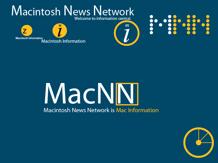
At the end of of 1999, I was asked to redesign the MacNN identity. All new logo, site design and business cards. At the time, most Mac sites looked the same and tended to use default browser colors and fonts. I wanted MacNN to be different.I thought complementary colors would be a good approach, so I chose blue and gold. I'm not sure if there were ever any other color schemes considered, but I think this one ended up working out well. It's now synonymous with MacNN.
I started off with a bunch of random experiments (this screenshots looks odd because I'm missing some font I used then):
None of this was quite "it," but there were some promising elements.
Eventually, I narrowed it down to one key design that centered around the magnifying glass tool. The idea was that MacNN would help you get closer to your information. Maybe that's just justification, but it made sense at the time. In any case, it's instantly recognizable, and probably better than just making up some random shape.
Apple was still using Garamond as its corporate font at the time, so the text in the MacNN logo used the same font. The only consideration left was the tagline. I couldn't imagine writing something like "In-depth technology analysis from trained professional..." yada yada, so I went for something short and quirky:
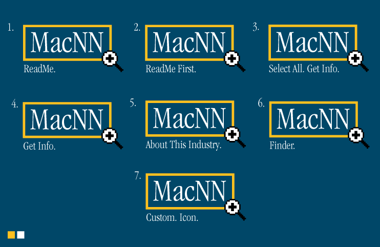
Some of these are a bit too quirky, maybe, but they all had some sort of meaning. I liked "Finder" just because it was almost too short (one word?), but still had a Mac association. Maybe not practical, though.
We settled on "ReadMe First" on the dark navy background.

Even now the tagline seems a little unconventional, but I like it.
The site design was a bit more involved, but I delivered something that looked very much like this:
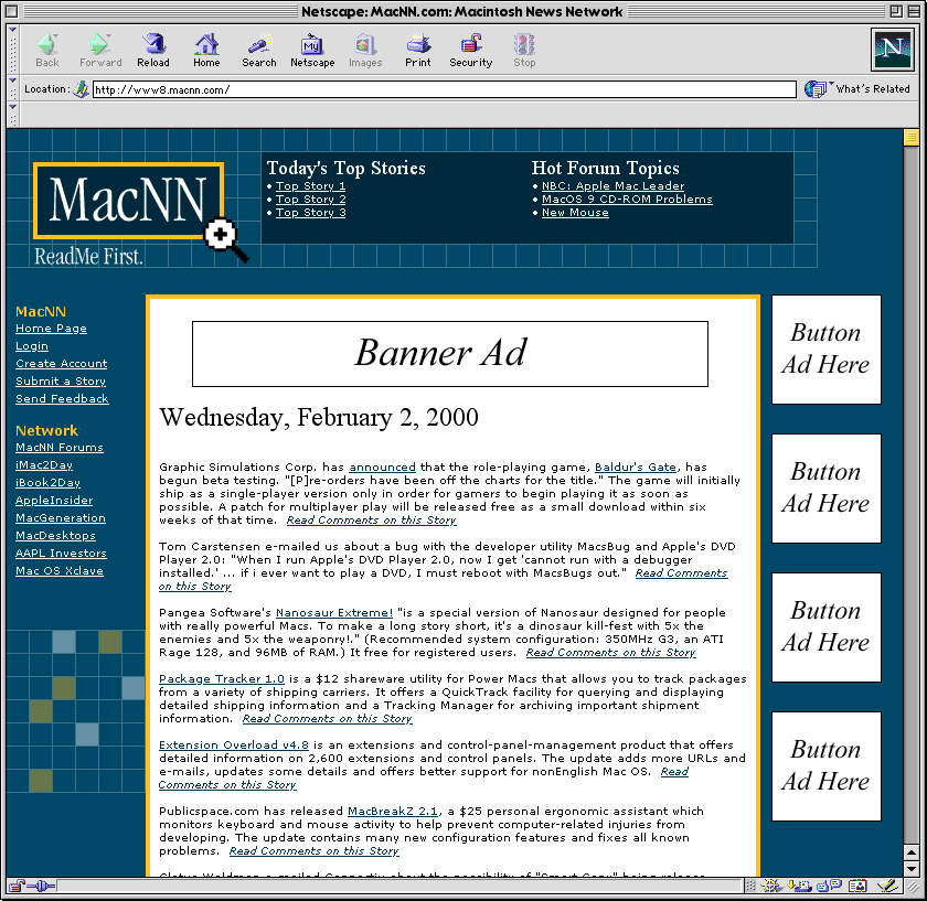
This was more or less what the site looked like for several years until the most recent redesign. The current identity still uses many of the same elements: blue and gold, the "ReadMe First" tagline, as well as the magnifying glass, albeit updated for the Mac OS X era.
One last note. If you look at the HTML source on the MacNN home page, you'll see references to kermit.macnn.com. At the time the site was redesigned, my co-worker had a kid who was into Sesame Street, so we had machines with host names like grover and elmo. This got passed on to MacNN in the form of kermit, which lives on today.

Designing the MacNN Identity
Posted Nov 6, 2006 — 5 comments below
Posted Nov 6, 2006 — 5 comments below


Jeff — Nov 06, 06 2316
Kool — Nov 07, 06 2317
Adz — Nov 07, 06 2320
Adam Hall — Nov 09, 06 2367
pat — Nov 16, 06 2419