A Quick Review of Tweetie for Mac
I have a secret to share. Up until now, I've gone out of my way to not use a dedicated Twitter client because I wanted to have a natural barrier between me and another distraction. But Tweetie for Mac has changed my opinion. The joy of using it so clearly outweighs the risk that I'm officially in.Since that I haven't used a dedicated client on either iPhone or Mac, I'm coming into this with fresh eyes. If you want a comparative review, I'm guess there will be quite a few shortly.
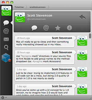
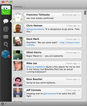
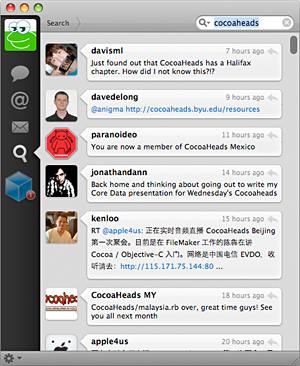
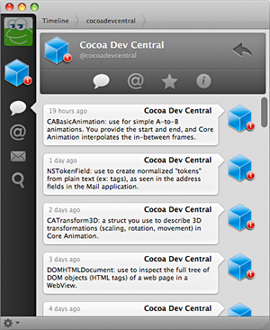
The tagline on the atebits site is "suspiciously simple software" and that's exactly what we have here. Tweetie asks you for your account info, then you're off and running. You can see your timeline, mentions/replies, direct messages and search — all in a very compact, exceptionally elegant window.
There may not be a single standard control used in the main Tweetie window, but it doesn't feel out of place in the least. If anything, it's forward thinking in its minimalism and subtle touches. Everything here is essential.
And maybe the stripped-down feature set is really a reflection of the larger iPhone influence in the user experience. Aside from the window orientation and animated transitions, the scroll bars are near replicas of those in UIKit. This actually woke me up the fact that I so rarely (if ever) use the single-step arrows in the standard Aqua scrollers that they're just taking up space most of the time.
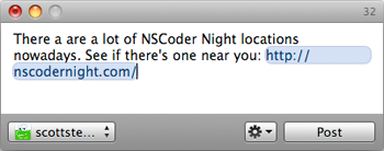
Things work as you would expect: double click on a reply to see the conversation, double-click on a user's icon to see their profile, and hit Command-N to create a new Tweet. You can also set system-wide global shortcuts for creating Tweets and bring the app to the front. Drag images directly into the new tweet window to have them upload to an image service, and convert URLs to shortened versions right inline.
The UI is filled with a number of subtle effects which set a mood and give the app its character. Tweetie is exactly what most Mac and iPhone developers want to make: an app that simply works as you'd expect, stays out of your way, and does it all with style and fun. If you have a Mac and use Twitter, you will probably thoroughly enjoy this app. If you don't use Twitter, you may find yourself creating an account just to try this thing out.
Tweetie for Mac comes out on Monday.

A Quick Review of Tweetie for Mac
Posted Apr 19, 2009 — 14 comments below
Posted Apr 19, 2009 — 14 comments below




StuFF mc — Apr 19, 09 6690
Maxime — Apr 19, 09 6691
Like the ability to hide the dock icon... or Growl support?
Thanks :)
Rob Morris — Apr 19, 09 6692
Tweetdeck has served me well thus far, but it feels a little out of place on a mac and rather clunky in bits.
Harley Turan — Apr 19, 09 6693
Micmoo — Apr 19, 09 6694
You normally can make any app hide its Dock icon by setting the LSUIElement to 1 in its Info.plist file
You can add it right above the closing </dict> like this:
<key>LSUIElement</key>
<string>1</string>
</dict>
</plist>
Micmoo — Apr 19, 09 6695
http://www.macgeekery.com/gspot/2007-02/hiding_applications_from_the_dock
Scott Stevenson — Apr 19, 09 6696
I think they may be adding some last-minute features before launch. That said, there are a number of display-related options to do things like control scrolling behavior, whether to display user name or full name, font size, that sort of thing. You can also select the image sharing and URL shortening services.
Carlos Fonseca — Apr 19, 09 6697
Christian — Apr 20, 09 6698
Rafael Bugajewski — Apr 20, 09 6700
Oriol Ferrer Mesi — Apr 20, 09 6701
Ted Todorov — Apr 24, 09 6719
The iPhone version of Tweetie doesn't have this issue.
Cyprian Gwd — Apr 29, 09 6724
I don’t know why, but I taking it as really time stealer.
aquaibm — Jul 11, 09 6827