


Yahoo Maps vs. Google Maps
So I played around with Yahoo Maps for a little while. It's clear that they're trying to meet or beat Google Maps, but it may be a losing battle. But first, what's good?I like the live traffic feature. I really like when you scroll through the driving directions, it dynamically highlights the relevant points on the map. I also find it handy that mousing over points of interest on the map will cause them to auto-expand and display more detail.
So those are the high points. But there are a number of low points as well, many of them related to some subtle user experience issues. First, Yahoo Maps is a lot more sluggish than Google Maps, at least in Safari. Perhaps this is due in part to the fact the Google is all Ajax and Yahoo is Flash-based.
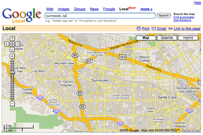
Next, a simple test. What happens if I just type "Sunnyvale, CA" into the search box of each app? Google Maps shows me an overview of the city. This is an example of Doing The Right Thing By Default. What does Yahoo do? It doesn't change the map at all but it lists the following items:
1. Well Fargo Bank
2. Floratique Flowers and Chocolate
3. Quality Inn and Suites
4. Sushi House
5. C & L Construction
6. Syan Izakaya
How does this relate to the search? Number 6 is actually somewhere in Oregon. If I make the window small enough that California doesn't show, Yahoo doesn't find any results for Sunnyvale, CA.

So that's one thing. Next issue: clutter. Yahoo seems to be stuck on the Microsoft school of thought when it comes to user interaction. Google, for the most part, subscribes to the Apple school of interaction -- show what's vital, make the rest easy to find.
Yahoo Maps has UI everywhere. It's like they're afraid to leave things out. There's a pair of "Get Directions" textboxes that are always visible. The search box is wedged on the left side of the window, where it wastes the most space.
By contrast, Google's search box runs along the top. Its driving directions UI is loaded and displayed on demand. You can summon it either by clicking the "Get Directions"" link, or by clicking a point of interest and choosing "Directions To/From Here." In both cases, the directions UI is swapped in for the existing UI, saving tons of space and reducing confusion.
Yahoo has a preview window which shows context for the current map, but there doesn't appear to be any way to make this go away. And how do I a bookmark or email a URL to the current map view? I realize I can email the map itself, but I want a pointer, not a copy. I'd also like satellite views in some cases, even if it's often just for fun.
On top of all of that, Yahoo has tons of text, tons of hit points, tons of links. This is nothing new for Yahoo, but it's the polar opposite of Google. The latter knows how to get out of the way of the user.
Yahoo has some nice features, but none of them are must-haves. In other words, none are worth the excessive UI and general slowness. I want a tool that is practically transparent, and Google Maps is much closer to fitting that criteria.

Yahoo Maps vs. Google Maps
Posted Nov 3, 2005 — 7 comments below
Posted Nov 3, 2005 — 7 comments below


jcburns — Nov 03, 05 507
But yeah, there's a certain elegance that isn't here...and surprisingly, some of it comes from using Flash (the zooming in and out until it's pixely and then loading the new tiles...eh, don't like that much. The basic idea of "as much UI as you need, and not a bit more" is certainly absent.
lookmark — Nov 04, 05 509
Udi Falkson — Nov 04, 05 510
This is actually one of the nicest things Yahoo! has done with this application. You can just take the current URL in the browser at any time and bookmark it or email it. Give it a try. This is a big improvement over Google's "link to this page" link.
aaron — Nov 04, 05 511
One of the cool things about Yahoo! Maps is that now you get a box C. Enter another address. And you'll get driving directions from A to B to C. String together as many driving directions as you want.
The "Find On Map" section is used for finding things on your current map view like schools, atms, pizza places, etc. You can either browse by category or type in search terms.
Also, if you don't like to see the UI stuff on the left hand side, just click the little arrow (located between the map and the UI stuff) and it goes away.
Scott Stevenson — Nov 04, 05 512
Ah, you're right. Whoops.
aaron said: And you'll get driving directions from A to B to C. String together as many driving directions as you want.
I guess this strikes me as an odd case to optimize for.
Also, if you don't like to see the UI stuff on the left hand side, just click the little arrow (located between the map and the UI stuff) and it goes away.
I saw that, but for some reason it didn't seem like it was working yesterday. Same thing with the bookmarking. Hmmmm.
Bill Scott — Nov 07, 05 517
I didn't see it either till someone called it out.
Then you have nothing but map to look at.
Morgan Aldridge — Nov 15, 05 553