iPod Shuffle and Zune Ads Compared
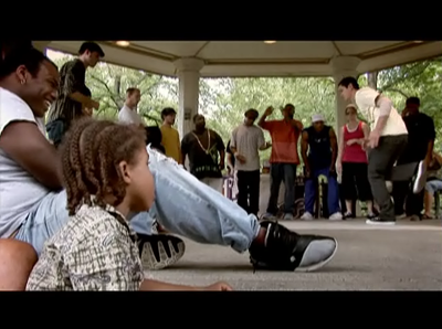
All technology issues aside, I like the contrast between the Zune ads and the brand new iPod Shuffle ads. On the surface, you have some similar elements: young people in designers clothes against indie-ish music. A bit deeper down, differences are striking.The format for most of the Zune ads is to create an environment of people just hanging out, in way that's designed to look candid and casual. The camera moves around as in a reality show. Once that's setup, they insert a Zune into the shot. Until that point, the commercial could be for anything from Gap to Coke.
I'm also fascinated — fascinated — by the fact that the spots pointedly highlight what Steve Jobs said about the Zune file sharing feature:
Here's what Steve said in Newsweek:
"I've seen the demonstrations on the Internet about how you can find another person using a Zune and give them a song they can play three times. It takes forever. By the time you've gone through all that, the girl's got up and left!
You're much better off to take one of your earbuds out and put it in her ear. Then you're connected with about two feet of headphone cable."
And there it is, right in the ad for the thing.
The iPod Ads
The conventional iPod ads with the deep black sillouttes against pastel grounds are instantly recognizable, to the point that even the spoofs are recognizable. What's interesting? No faces, and the clothing all blends together. The iPod itself stands out in front of everything else.
The camera is always fixed on the one character and the iPod. The racial makeup of the characters is generally left to the viewer to decide.
The iPod Nano ads flip the equation around a bit by making the iPod itself the pastel, but the result is the same: the focus is on the iPod, not the people.
(Is the Tiger thing just an accident? Unlikely.)
The new iPod Shuffle ads are something else entirely. You can see the people in designer clothes. No pastel backgrounds, no silhouettes. Still, the anonymity of the characters is preserved because the faces are cut off. The camera is static. I love transitions between the characters. Subtle yet suprising.
I love the eerie lighting.
Throughout all of the iPod ads, two elements remain: there's only one person on the screen at any time and the iPod itself is always in the shot. It might be that the Zune approach is effective, but it's interesting that the tactic is to set the stage first, then introduce the Zune near the end.
Okay, now that I'm done over-analyzing, I'd like to say I love the Zune ad with the basset.

iPod Shuffle and Zune Ads Compared
Posted Nov 22, 2006 — 15 comments below
Posted Nov 22, 2006 — 15 comments below


ssp — Nov 22, 06 2469
But I could imagine that plenty of middle class parents will love the idea and buy their kid an MS christmas present. And then they won't understand why the kid is unhappy... ah well.
Bob Frank — Nov 23, 06 2470
http://www.youtube.com/watch?v=PYyBULXzWdk&NR
http://www.youtube.com/watch?v=Hd_tmfGmzMo
http://www.youtube.com/watch?v=ILEnu8gdus0&NR
Scott Stevenson — Nov 23, 06 2471
I love the first one, the second one didn't load for me. The thing that makes it, though, is one of the comments on the YouTube page for the third video:
"And after 3 days (or 3 times using), he has to give that eye back, or what?"
Excellent.
James — Nov 23, 06 2472
Julian Bennett Holmes — Nov 23, 06 2473
Steve-o — Nov 23, 06 2476
Wouter Schut — Nov 23, 06 2477
terr — Nov 23, 06 2478
WahooRob — Nov 23, 06 2479
Mantra — Nov 23, 06 2481
The Microsoft ads are starting with the benefits and then slipping in the product. Big mistake, because it's too easy to identify with the benefit and then forget what the ad for for - we've all seen "artsy" ads on TV that leave you with the question: "now what was that advertisement for? I have no idea!"
Compounding this are two bigger problems: 1) what to early adopters see as valuable, and 2) is the brand promise of "the social" going to be delivered on or be perceived to be deliverable? The entire concept of social WiFi mp3 players is bleeding edge in terms of technology adoption. That means the "mainstream" mid-to-late adopters pictured in the ad are <b>not</b> the people who this ad must reach or sell. Next, we already know from these early adopters analysis and publication on the web that "the social" isn't because the Zune has a fatally flawed design due to spineless kow-towing by-committe to media IP control freaks - thus the ads are <i><b>Anti-Branding</b></i> the Zune by promising something that ultimately can't and won't be delivered if you buy the product.
Base on past historical examples of both company's marketing, none of this is very surprising.
RobInNZ — Nov 23, 06 2483
Scott Stevenson — Nov 24, 06 2484
I don't think that's an accident. The iPod is always in the shot, though.
Andrew Pontious — Nov 24, 06 2487
The iPod ads have instantly recognizable music. Great hooks. I can't get the shuffle 2 ad out of my head, and I don't have a freakin' clue what the lyrics are.
Zune ads - they had music?
Jens Tenhaeff — Nov 27, 06 2492
By this I mean that all of the Zune-ads I have seen so far focus on a very narrow and specific sub-set of their potential audience, thereby excluding everyone else (i.e. people over 30 with a mortgage and without tattoos).
The iPod-ads on the other hand are open enough to include practically everyone. Although they feature "young" people as well, these are pictured in such an abstracted manner that anybody can identify with them, because everybody was young once. Back in the 80s, I was shaking it like any iTunes-silhouette out there. But these Zune-kids are too "now". I can't abstract from their very time-specific appearance and find myself in there.
AFAIK George W. Bush has an iPod. Could you picture him with a Zune, after seeing those kids?
okada — Dec 13, 06 2682