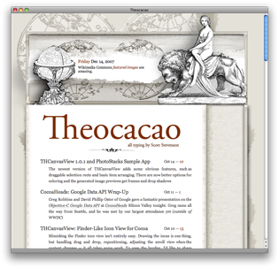
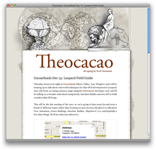
Theocacao Redesign for Dec 2007
A brand new design went up today. I did the initial prototype in about four hours, and spent the next ten days iterating through about thirty versions. I usually just put up whatever I like, but the changes were different enough that I showed it to one person ahead of time, just to check.My design criteria was basically this: I want a site I enjoy visiting.
I'm really interested in this idea of functional places — in particular stores or restaurants — you go to just because you want to be there. I think a lot of people know this feeling about the Apple Store, and it's played up at the 24-hour locations. There's a certain mood about a place that you want to experience.
This translates into web sites, too. Daring Fireball is an excellent example of this idea. It's not just a bunch of text — John Gruber has sculpted a particular feeling into the granite. Although maybe it's too few degrees of separation, I think this applies to Jesper's Waffle, too.
In fact, these are two sites I'll visit without prompting from an RSS reader. They're both very well-written, of course, but the fiber of what they're about is actually woven into the presentation. I dig that. I think you know something about the authors just from the sensibilities of the sites.
While Theocacao doesn't look much like these sites, I hope something similar comes across: that there's a particular feeling being sent out over the airwaves. I guess this idea is at the core of the designs for Cocoa Dev Central and Cocoa Blogs design, as well.
I hope you guys and gals enjoy it.

Theocacao Redesign for Dec 2007
Posted Dec 15, 2007 — 14 comments below
Posted Dec 15, 2007 — 14 comments below


Jacob Rus — Dec 15, 07 5193
Moitah — Dec 15, 07 5194
The paper scratch at the bottom is beautifull.
Joe Goh — Dec 15, 07 5198
William Wilkinson — Dec 15, 07 5199
Scott Stevenson — Dec 15, 07 5200
Fixed. Thanks.
John — Dec 15, 07 5201
Different topic, what has happened with cocoa blogs? Am I the only one who doesn't see updates. I really loved the updates, it was real nifty. One can do these google homepages and get all the latest posts of the blogs you like there etc blah blah, but I like cocoa blogs a heck of a lot more. Plus I don't have to hunt alone for good cocoa related blogs and info, all of us can do that. It would rule if it was updated more.
And onto the next topic, any chance Cocoa Dev Central will be fully 10.5 updated? I know that it's a lot of work, but wouldn't it be nice with updated screenshots, correct looking "press here and here" and maybe a few new ones as well? The ones that doesn't feel as up to date can always be relegated to let's say the archive.
Would a donation help mayhap?
Scott Stevenson — Dec 15, 07 5202
Things are in progress.
any chance Cocoa Dev Central will be fully 10.5 updated
Yes, there is a chance. A very good chance.
It's probably obvious, but I was spending some time on this site.
Vincent — Dec 15, 07 5203
But I stil find the previous design better.
Lee Falin — Dec 15, 07 5204
Winsmith — Dec 15, 07 5205
Jesper — Dec 15, 07 5206
It's a good look. Now make it remember the comment name/email/URL details and make the format popup look less out of place. Chop chop!
Jeff Johnson — Dec 15, 07 5207
You must take all prompting from your RSS reader! It is a hundred times more technologically advanced than you. Resistance is futile.
Mills — Dec 21, 07 5263
Great work!
Scott Stevenson — Dec 21, 07 5267
Thanks. I really appreciate that.